
Case Studies
Northwick Park Hospital A&E Signage- A Better A&E
Northwick park is one of the largest A&E department in the UK with over 5,000 people passing through each week. The initial project was on a much smaller scale where we just renewed the reception signage for the Urgent care centre. The team were very impressed with the look and feel of the signage as well as how the project was managed that they asked us to revise all the signage throughout the A&E department. This involved consolidating the number of signs in the department and ensuring there was a uniform look about them which was easy to follow and complied with the ‘A better A&E’ scheme.
Employees: 9,000
Based: West London
Industry: Healthcare
Site visit
The site visit was an integral part of the project as it was important we fully understood the layout of the hospital to ensure the signs were planned in the perfect way. To do this we did a walkthrough of the department and reviewed the current signage. This Allowed us to gain an idea of what was required and to get to know the route customers would be taking which will help in the planning and designing of the new signs.
Considerations to take into account:
- Standardised design – complying with ‘A better A&E’ scheme.
- Consolidate the number of designs
- Department had to continue operating with limited disruption
- Respect patient privacy
Planning
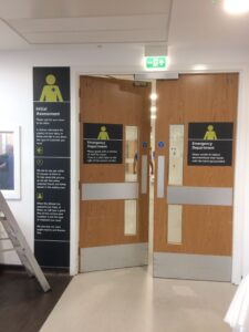
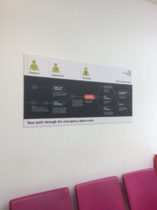
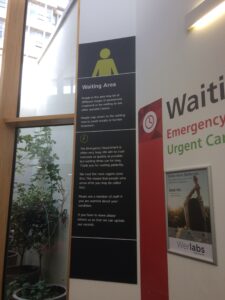
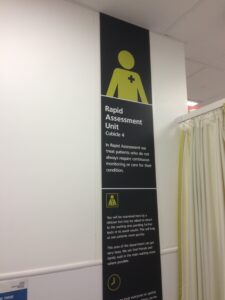
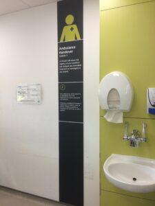
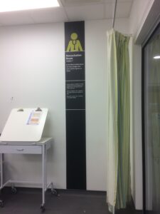
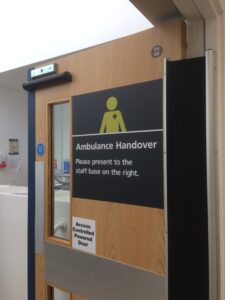
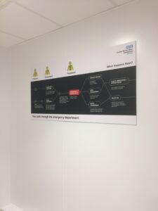
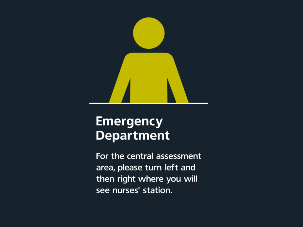
There were a variety of different signs to design. These were: Pathway maps, Door signs, directional signs, and patient information signs. Each one needed to be planned carefully to ensure all the information was captured in a way that was patient friendly.
Design was a key consideration as to comply with the Better A&E guidelines fonts had to be a certain size and the colours of the text and the background were also important. This was to ensure the signs were visible for all.
The pathway map needed to flow and be easy to understand so that patients and visitors could easily follow and know where it was they needed to go. These tied in with the directional signs which we did to come out of the wall to point patients and visitors through and make the journey through the hospital as easy as possible. The patient information signs were done as floor to celling signs to cover all the information required while being mindful of space.
The Proofing process took a long time due to the levels and checks which they had to go through. There were also a few amendments to ensure the final product would be perfect. Everything was then triple checked to ensure there were no errors.
Installation
The installation was done in a phases to limit disruption and make sure the hospital could still run as normal. The signs were removed and replaced in one go to ensure the information was always there.